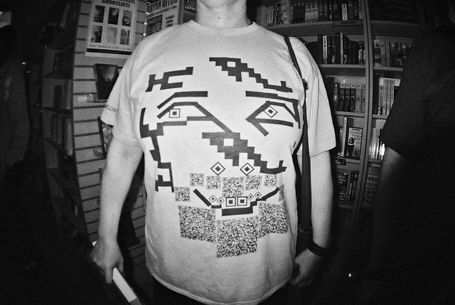
You’ve gotta love bad clothing contests. Too often, we base competitions around who’s the prettiest, the most skilled, the most fashionable. Sometimes, it’s nice to just let loose, let our hair down, and celebrate the most awful, visually-offensive outfits we can find.
After all, everyone’s bought a T-shirt while drunk that caused them to later wonder just what they were thinking. Everyone’s had a well-meaning relative buy them a sweater that looks like death translated to fabric. And everyone has, through no fault of their own, made a bad fashion choice or two in their lives.
Let’s say you’re really serious about winning one of these things, though – you’re serious about finding the most hideous shirt you can. Sure, you could go thrift shopping for one. But the best route to victory is to simply make your own – an art form in and of itself.
Here’s a bit of advice to help you along in that:
- If your T-shirt contains any text, use as many fonts as possible. The more different fonts your shirt contains, the better. For bonus points, consider combining fonts like Impact, Trajan, Comic Sans, Verdana, Bradley Hand, and Curlz MT.
- Speaking of text, most people tend to read from left to right. Remember that when you position your words on your shirt – and if you need inspiration, there’s an entire community on Reddit dedicated to examples of people who disregard that fact.
- Got some artwork you want to put on your shirt? Great – load it up. But before you do, make sure you choose low-resolution instead of high-resolution. Anything higher than 300 pixels or so per inch, and your shirt might end up looking a bit too good.
- Make liberal use of clashing colors. Brown and black, gray and brown, red and green, red and orange, and so on. If two colors look like they should never be in the same room with one another, they need to go on your shirt.
- As an addendum to the above, use as many colors as you want. You’re trying to make the ugliest shirt imaginable, and the busier it is, the better.
- Throw the concept of white space out the window. This shirt is visual vomit, and you want it to reflect that. Make it as busy and sloppy as possible – clipart with several different art styles, multiple shapes with no rhyme or reason, and so on. As a disclaimer, this is one area where you need to be careful – if you go too far overboard here, you might just end up with modern art instead of a shirt.
- Think about what your shirt is saying – the more bizarre, nonsensical, or stupid your quote, the better.
That should be enough to help you get started. We look forward to seeing what horrible ideas you come up with. You can use our design studio to make them a reality.
