Whether you’re putting together a design for a T-shirt, designing the visuals for ad placement, or putting together the layout of a website, you’re ultimately drawing on the same basic principles of graphic design. These fundamental building blocks serve to inform everything else you do and act as the foundation for every advanced technique you learn. If you’re looking to make the leap into a career as a graphic designer, this is where you should start: with these three basic concepts.
Lines and Shapes
Lines and shapes are present in almost every graphic, even if it’s only as a solid border. Most of the time, they’re used to cordon off different sections of an arrangement or direct the viewer’s attention in a specific way. By creating optical paths in this fashion, one can create a wide range of unusual impacts and effects.
Bold, thick lines will tend to draw more attention, while thinner lines will often fade into the background. Color, which we’ll discuss in a moment, is essential as well. Darker colors will inevitably draw the eye more than a lighter shade. The style also matters here, as people will experience a dashed or dotted line differently from a solid one.
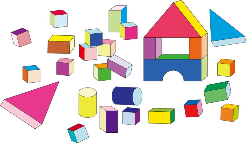
Shape, or form, is what you get when you combine several lines into a single shape. There are many different types, ranging from the concrete (circles, squares, triangles, etc.) to the abstract. Most graphics include at least one or more shapes.
Forms, like lines, have certain common associations in the mind. Circles are often tied to nature and movement, while squares are viewed as structured. Color, background, and style can also change the viewer’s perception.
Color
Color is arguably the most crucial aspect of an eye-catching graphic, providing a powerful visual impact and a ton of associated emotions with a single glance. It’s also unique in that you don’t really need graphical training to recognize color, though you do need the training to understand how best to apply it. Different colors are typically used to evoke different emotions.
Red is often seen as passionate, blue as calming, green as lively, and so on. Color theory, explained in this piece by graphic design blog 99 Designs, is essential to understanding the effective use of color. Factors like saturation, shade, hue, tint, tone, and complementary colors all combine to change how one experiences a work.
Space and Texture
Effective use of spacing is crucial in creating memorable imagery. White space, also known as negative space, provides the viewer with a calm, open feeling. White space is especially crucial in graphics that accommodate written text, as it makes them far easier to read.
Having too little negative space may cause a graphic to appear cluttered, messy, or disorganized.
In addition to graphic design, negative space is also a popular concept in photography, as detailed in the Photography Mad Blog. When designing a graphic, think about how you want it to be framed. Where do you want the user’s attention to be drawn? What’s the most important element of your design?
Texture also plays a particularly important role, especially where clothing is concerned. A texture is, as explained by the graphic design tool Canva, the surface quality of a particular design. It’s the feel of an object or image, a background element that somehow still ties everything else together.
Starting With The Basics
As with any discipline, a concrete understanding of the fundamentals is critical to effective graphic design. Color, space, texture, shapes, and lines are the building blocks. It’s up to you to determine how to best fit them together, and how to discover your unique style as a designer.
